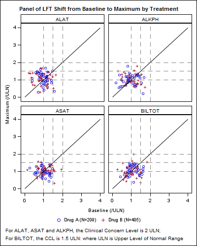
CTSPedia.org is a website of Knowledge Base for Clinical and Translational Research. On this site you can find sample graphs for statistical analysis of safety data for Clinical Research. Graphs included in this resource have been submitted by contributors, and include a graph for Liver Function for different tests by treatment.
This graph shows a panel of scatter plots showing the maximum upper limit of normal (ULN) value of a test over the treatment period plotted against the upper limit of normal for baseline, one for each test. The SGPANEL procedure is well suited to creating such graphs and the graphs shown in the link above can be created using a few lines of code.

SAS 9.2 Proc SGPANEL Code:
proc sgpanel data=LFT_Panel_Norm; panelby group / layout=panel columns=4 spacing=10 novarname; scatter x=base y=max / group=drug name='s'; series x=ref y=ref; refline 1 1.5 2 / axis=Y lineattrs=(pattern=dash); refline 1 1.5 2 / axis=X lineattrs=(pattern=dash); rowaxis integer min=0 max=4; colaxis integer min=0 max=4; keylegend 's' / title="" noborder; run; |
The data for the above graph is simulated.
The SGPANEL procedure creates a paneled graph with a grid of cells using one or more classification variables specified on the PANELBY statement. The procedure determines the number of unique values for each class variable, and creates a cell for al crossings of the panel variable values. Each cell contains a graph for the subset of the data for the crossing, and the plots in each cell are determined by the statements that are included in the procedure step.
Let us review the statements and options used in the above code:
- One class variable "Group" is specified on the PANELBY statement.
- We want all cells to be in one row, so we specify columns=4.
- Each cell contains a scatter plot of maximum upper limit of normal (ULN) value of by the upper limit of normal for baseline. Group variable is "Drug"
- The cell also has a series plot for the 45 degree line.
- Reference lines at 1, 1.5 and 2 on X and Y axes.
- The X and Y axis values are set from 0 to 4 with grid lines.
Many pages of code are replaced by a few lines shown above. An extra variable "Ref" is added to draw 45 degree reference line. With SAS 9.3, one can use the new LINEPARM statement to draw this line without need for generating data columns.
In the above case, we forced the layout to a 1 row x 4 column layout by setting COLUMNS=4 on the PANELBY statement. Creating the 2 x 2 layout is even easier, as that is the normal behavior of the SGPANEL procedure.
SAS 9.2 Proc SGPANEL code:
proc sgpanel data=LFT_Panel_Norm; panelby group / layout=panel spacing=10 novarname; scatter x=base y=max / group=drug name='s'; series x=ref y=ref; refline 1 1.5 2 / axis=Y lineattrs=(pattern=dash); refline 1 1.5 2 / axis=X lineattrs=(pattern=dash); rowaxis integer min=0 max=4; colaxis integer min=0 max=4; keylegend 's' / title="" noborder; run; |
Note, the code is almost identical to the one shown above, except for the lack of the COLUMNS=2 option. Judicious choice for graph width and height will result in a square aspect ratio for each cell. Options are available in GTL to get specific aspect ratio for the plot region and are planned for SG in the next release.
A style template is used only to fit the title and footnotes for the small size graphs in this article.
Full SAS 9.2 Code: SAS92_Code


2 Comments
Hi Sanjay,
I have a query in the panel headlabel. If I am displaying 21 panels in a page (3*7)and if i want to display few cells headlabel with RED color and the other with black. How I can control the attribute?
Could you please help me?
Thanks.
I don't believe there is any simple option to do that. What I would do is to suppress the headers, and add an inset to each cell showing the header information. Changing colors dynamically will not be possible with the INSET statement. But, I believe you may be able to use the TEXT plot statement to position the class value using a GROUP variable to control the color.